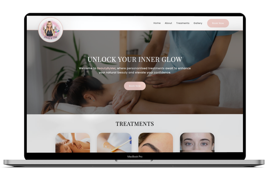
BeautyByMel - Beauty Therapist Website
Timeline
Feburary 2024 - April 2024
My Role
UX Researcher
UX Design
Web Developer
Tools
Figma
Figjam
Canva
Visual Studio Code
Introduction
BeautyByMel was a new beauty therapist business thats only online presense was through the popular social media platform, Instagram. This was great for people that were active on the social media platform but this left out a large audience of people that were not. They had no access to any information or an ability to book an appointment and because of this had not heard of BeautyByMel.
What the statistics say:
70% of customers prefer booking online instead of over the phone
Source42% of Brits want to make an appointment after hours or at weekends
Source85% of bookings are made using a mobile device
SourceThe Solution:
To create an eye catching, mobile friendly website that provided all the information users needed about the business, a simple way for them to get in touch and book an appointment and ultimately expand BeautyByMel's online presence to further than Instagram.
The Design Process
01 - Empathise
Talking to the owner
As with anything new its a good idea to talk to the person we're creating this for, to understand what they want and why they need it. We shouldn't be creating something just for the sake of it, we needed to create something that would actually be useful and solve our problem. This was a key part in identifying the problem that was being faced from the businesses perspective.
What do users think?
The most important part of our research is seeing it through our users eyes. They are the ones that will be using our product so it is paramount that we understand their feelings, experiences, motivations and expectations. Some key questions that were addessed at this stage included:
- What motivates users to look for a beauty therapist?
- What is important for you to see on their website?
- What are the pain points and challenges users face?
- How would users typically go about booking a treatment?
- If users couldn't find what they're looking for, what do they do?
Key Insights
- The main reason users look for a beauty therapist is to find someone who is reliable and good at what they do. Some users mentioned that they are simply browsing to see if they find anything they may be interested in.
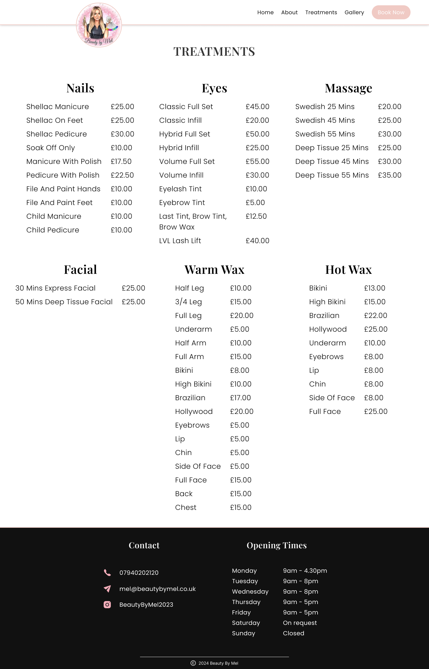
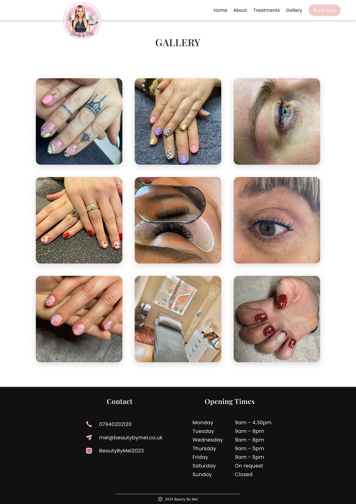
- Most important things users want to see when browsing are: Treatment and price list, Pictures, Reviews and Contact information/How to book.
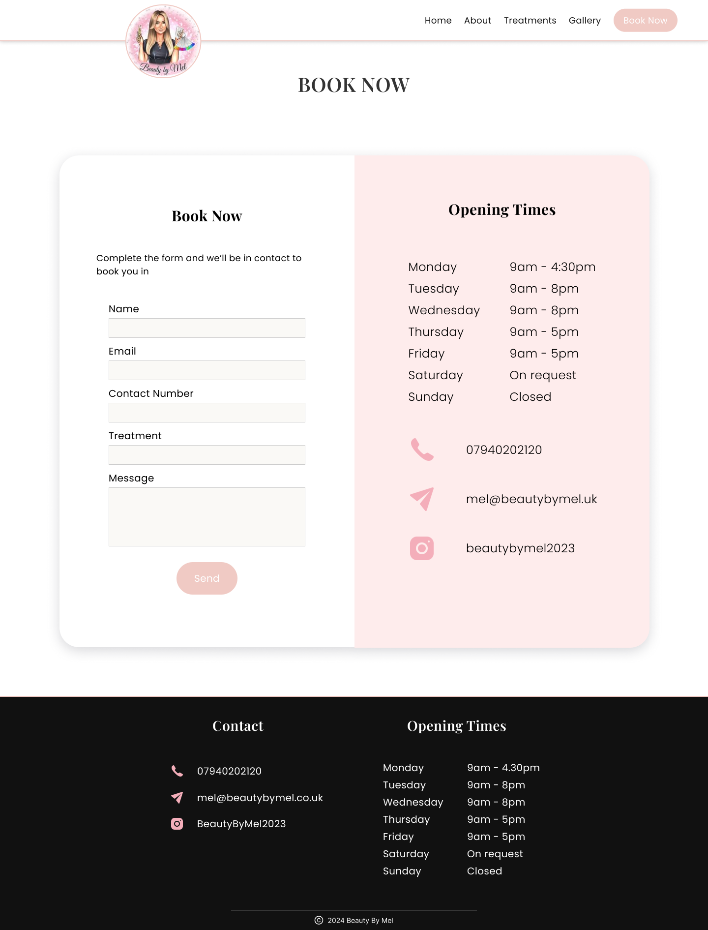
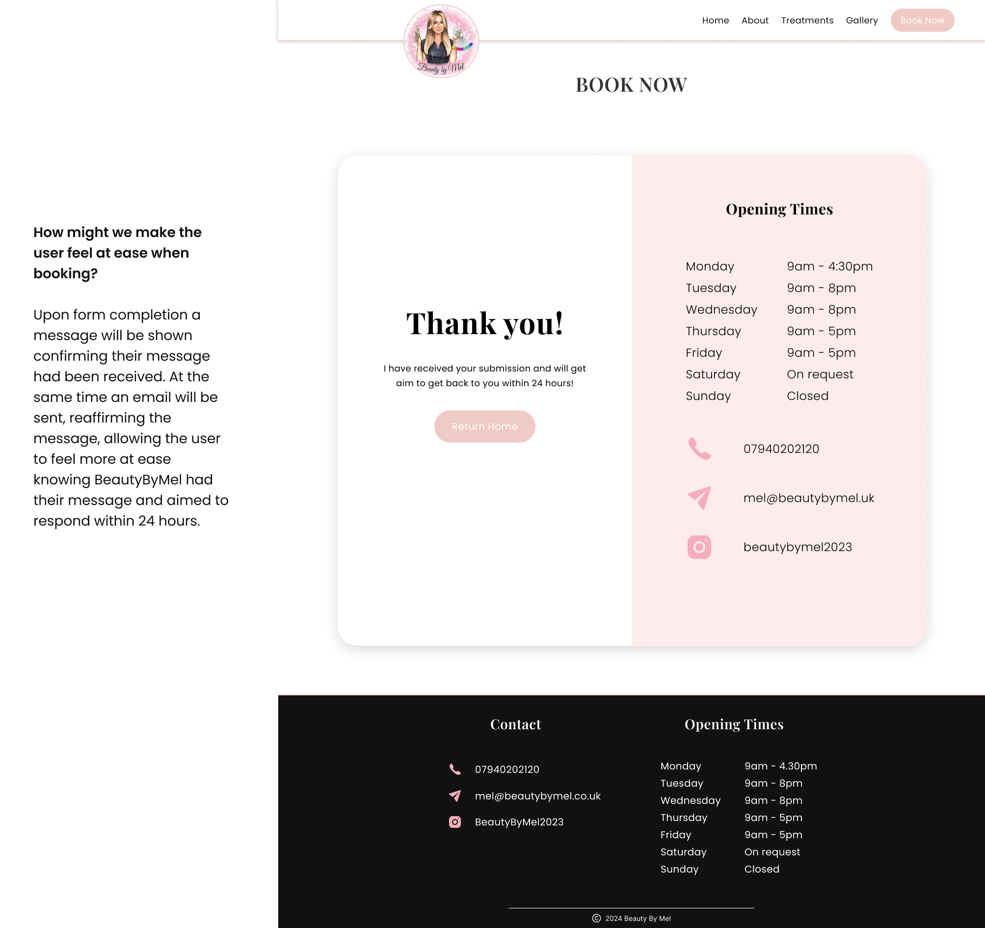
- Users faced a number of issues during the booking process. Some users were left worried as they didn't know whether there booking/message was received, other users found it frustrating when they cant find the information they were looking for and not being able to get through when calling.
- There was mixed feedback in regards to how users booked their treatments. It was found that typically older users preferred booking over the phone whereas younger users preferred booking online or through social media.
- Lastly, almost all users said that if they could not find what they were looking for they'd either give up or go to a competitor. This is why we needed to get things right from the get go!
02 - Define
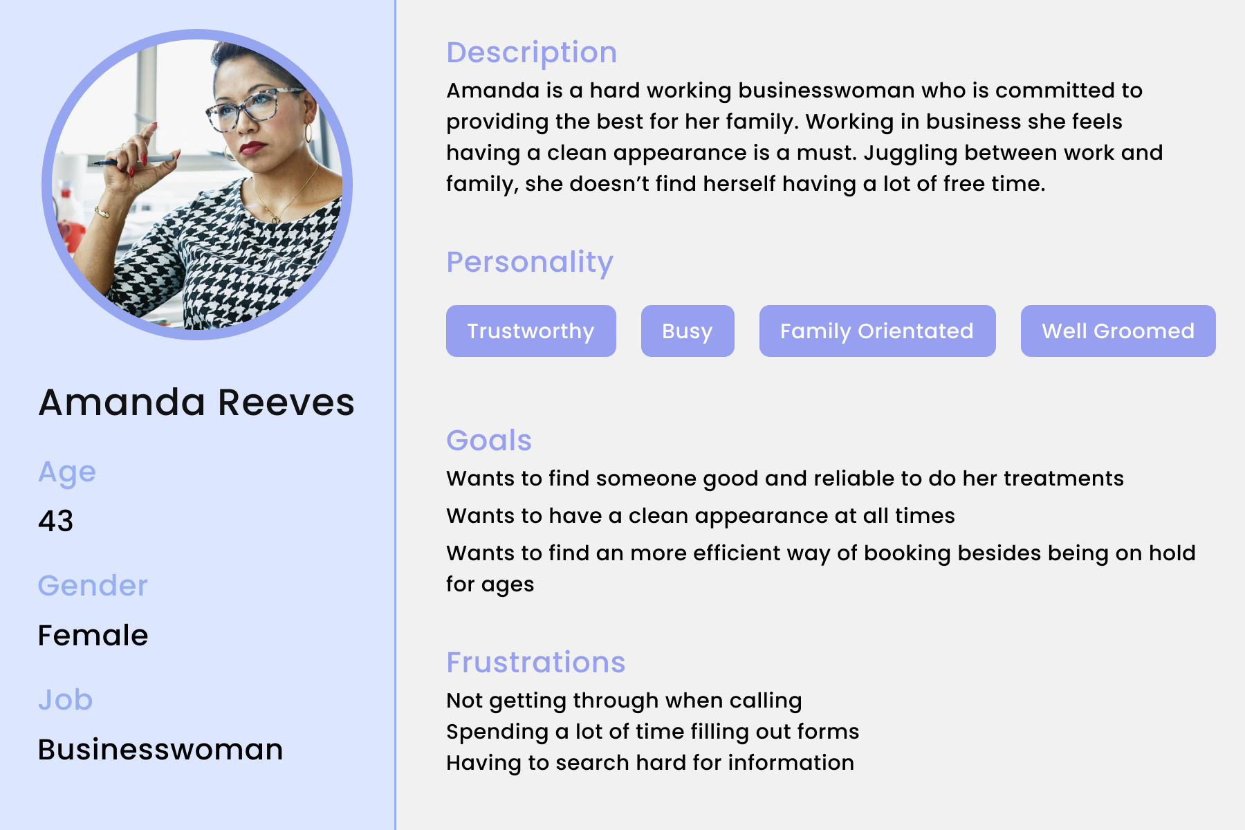
User Persona
Based on my finding's from my user interviews I created a user persona to enhance understanding for individuals who I am designing for.
Meet Amanda, a 43 year old businesswoman who is dedicated to providing for her family. She feels that working in business, she always needs to be presentable and maintain a clean appearance. Not only does she have a hectic work schedule but she also has the job of managing her 2 children outside of work hours.
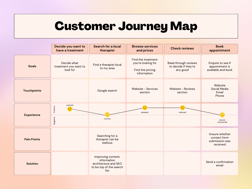
Customer Journey Map
I produced a customer journey map illustrating the typical user experience from discovering the business to booking an appointment.
Feature Prioritisation - MoSCow Method
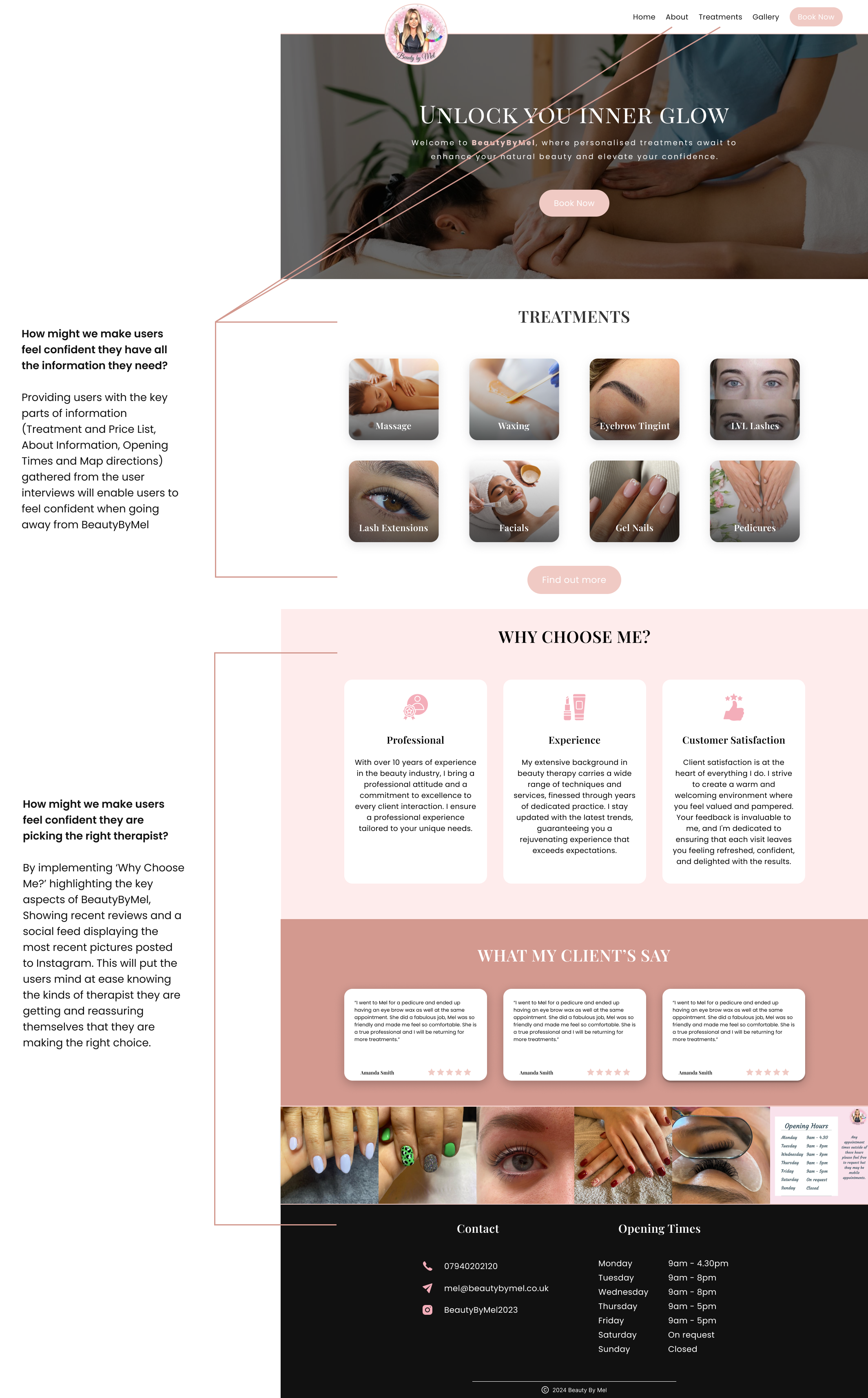
Going back to my user interviews I made a list from all the things users thought were important to see when browsing to find a beauty therapist. Using the MoSCow method, I seperated these into 4 categories: Must have, Should have, Could have and Won't have as seen below.
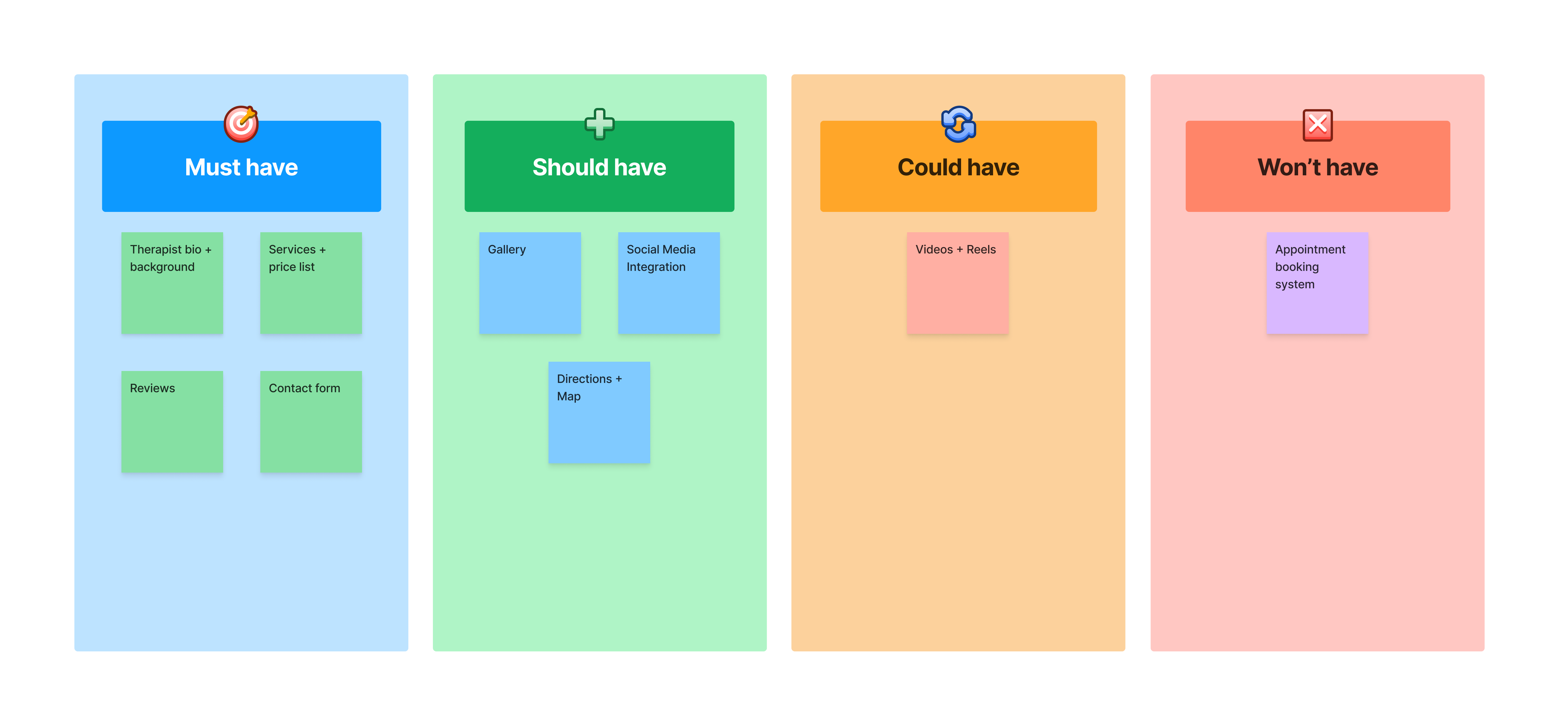
Must Haves: These were deemed to be a crucial part of the website, they HAD to be included, if not they'd do more bad than good.
Should Haves: These were not as important as our Must Haves but never the less, still should be included.
Could Haves: These would be nice to have, the website wouldn't fall to its knees without them but a nice finishing touch.
Won't Haves (For now): Pretty simple, these we simply just won't include, atleast not right now.
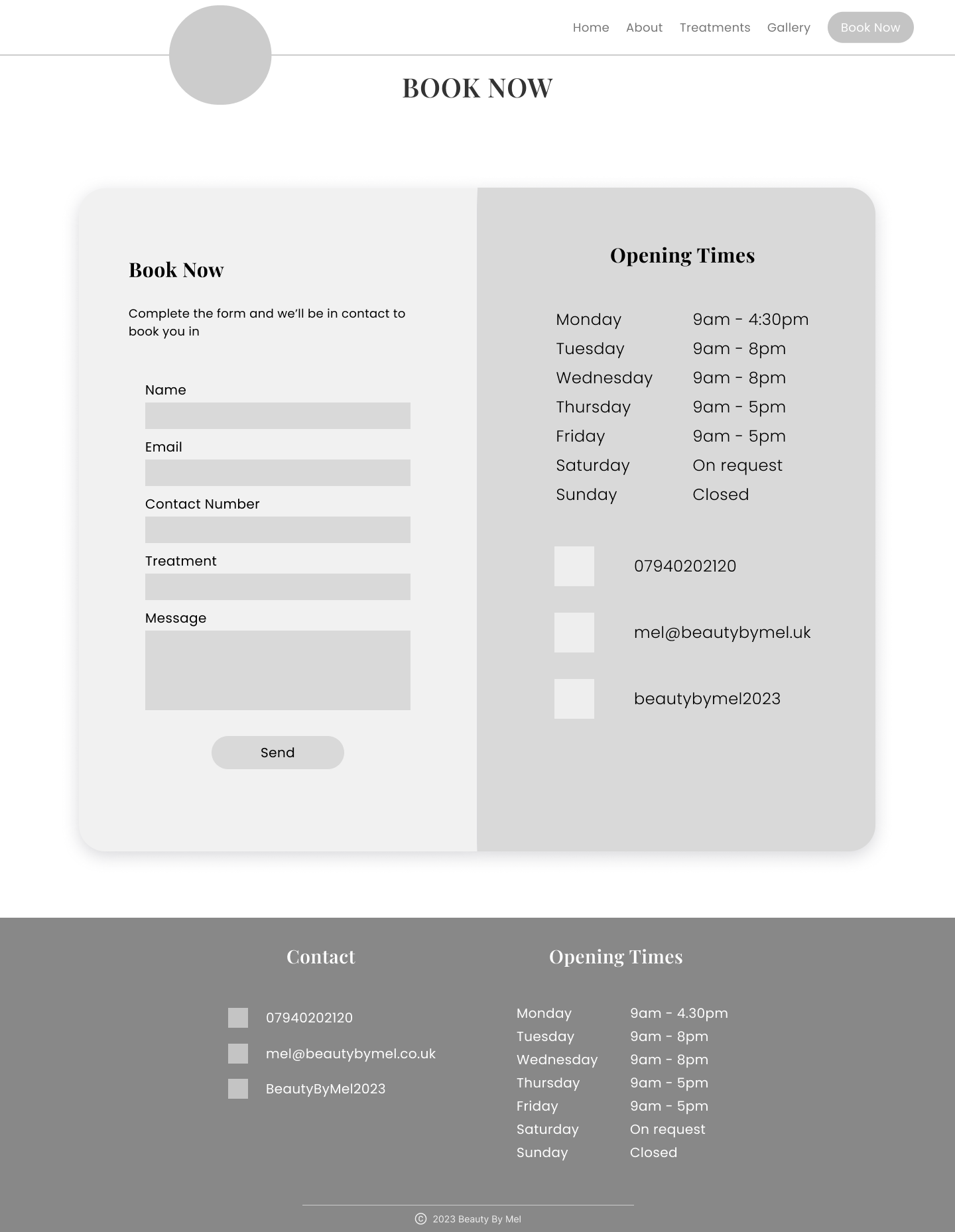
You may be thinking "Why would you not want to have an appointment booking system?". An automated booking system would be a fantastic feature to have, it would allow users to book online and outside of working hours but the reason this was not included was simple, project time constraints. We needed something that could be developed quickly, still allowed users to book online and outside of working hours. The answer was obvious .... a contact form. This doesn't mean that the idea of having an automated system was ruled out but for now, it wasn't a priority.
03 - Ideate
How-Might-We
Transitioning into the ideation phase prompted me to contemplate a series of "how might we" questions, inspired by key insights gleaned from user interviews.
-
How might we make users feel confident they are picking the right therapist?
-
How might we make users feel confident they have all the information they need?
-
How might we make the user feel at ease when booking?
These led me to create the following designs below.
Wireframes
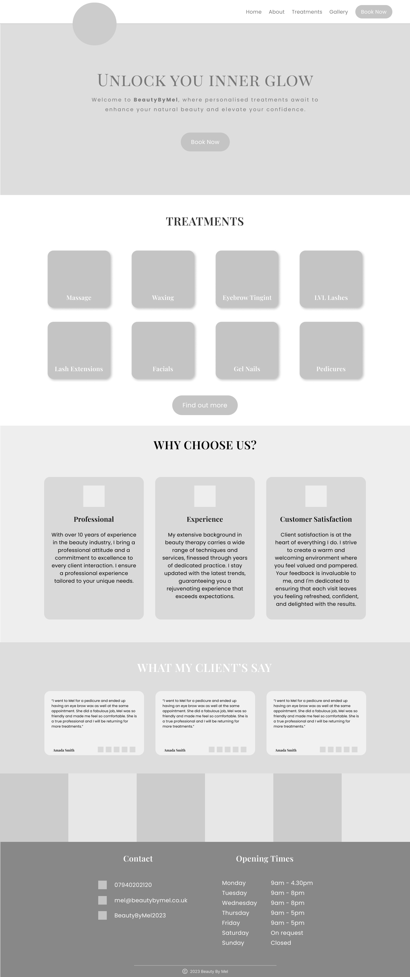
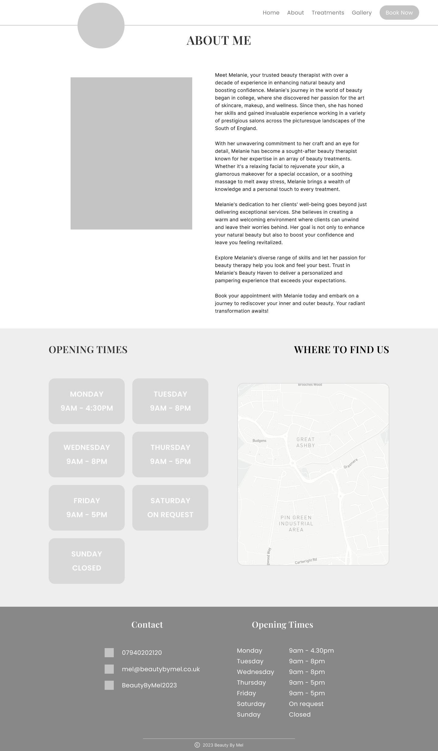
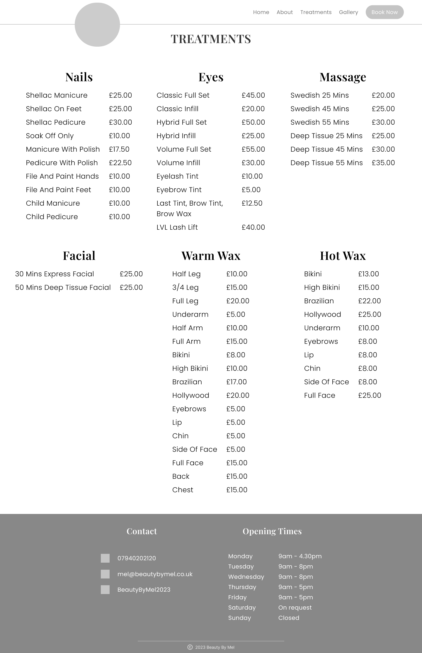
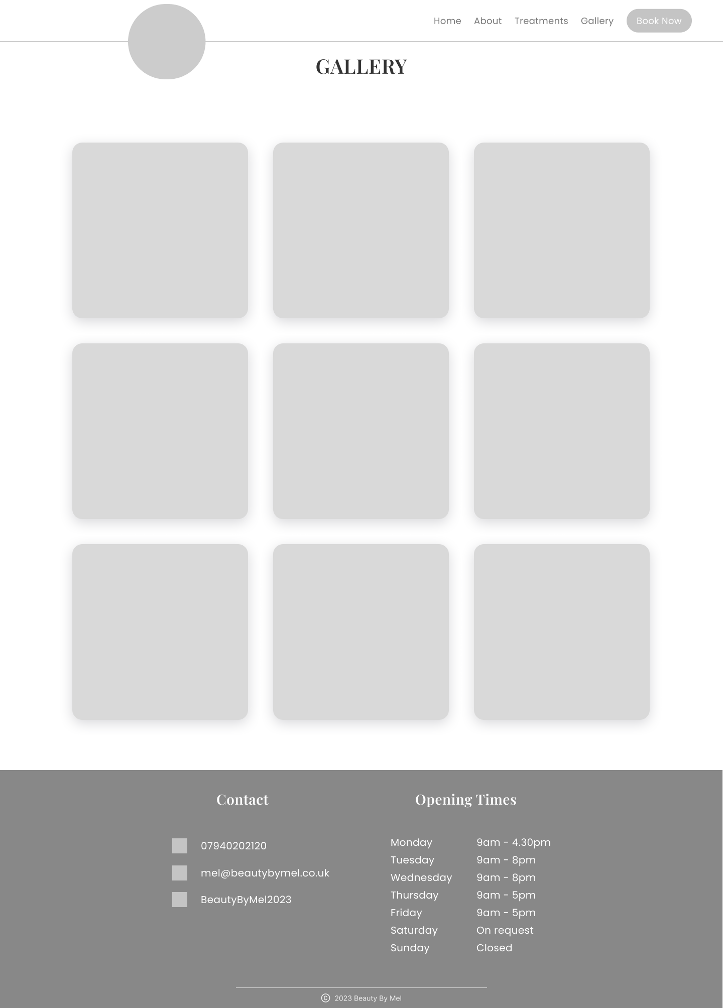
Prototype
Project Learnings
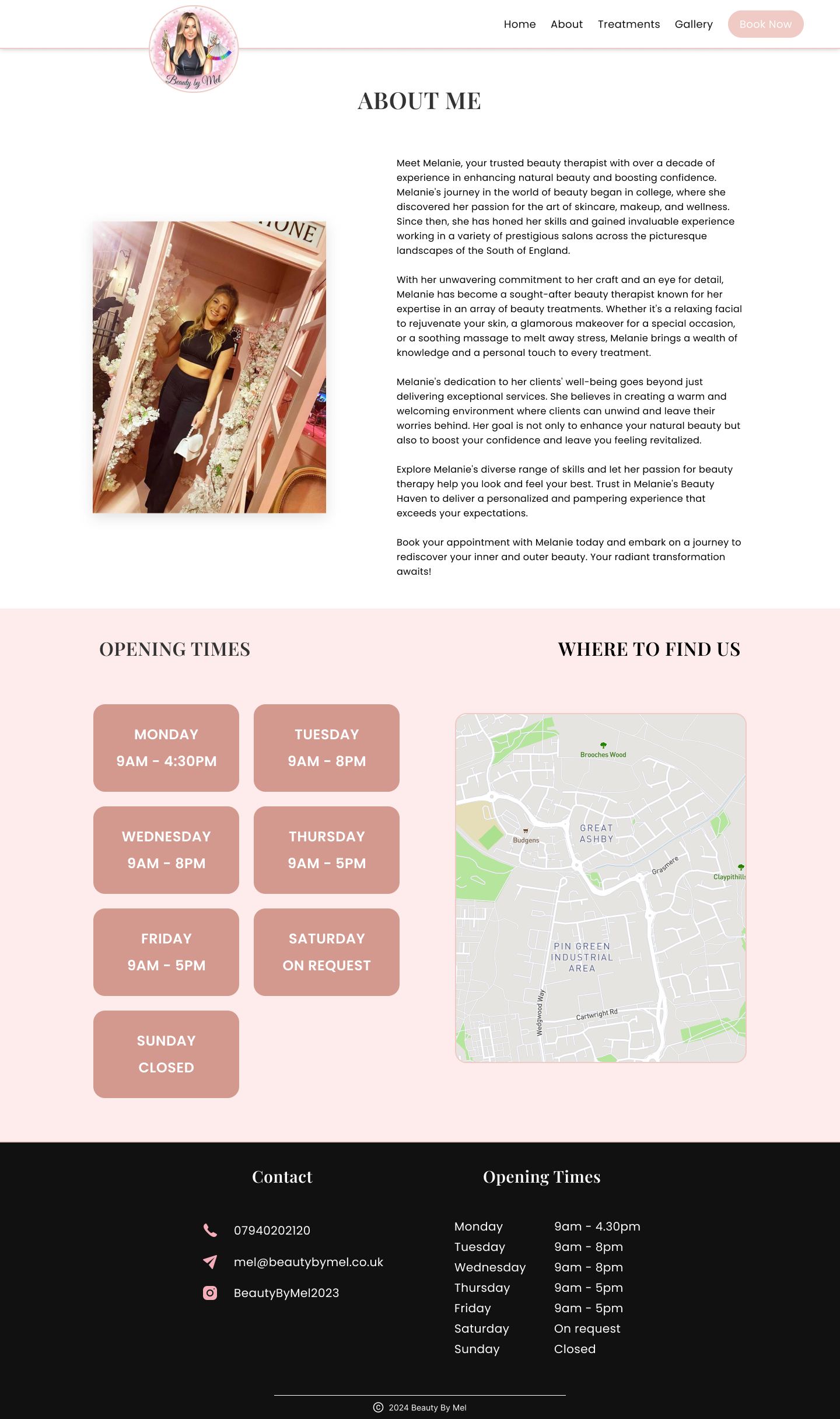
This was a great project to work on to further expand my knowledge and experience in UX, using different research methods to understand the user experience first hand. Something I found really interesting from a user I interviewed was that something they look out for is having a map and directions to the place they'd be attending. They suffer from anxiety a lot and not knowing exactly where they'd be going could trigger this. This is something that i'd never have thought of...ever! It reminded me that asking the right questions and not missing out any of our target audience members was crucial to ensure that we can create design solutions to offer the best user experience.
What would I do different?
Although the research I conducted offered me some really good insights, I feel that I could have gone a step further by conducting a competitor analysis to identify areas where my competitors were not doing so well and identify areas where I could be a step ahead.
Thank you for reading, check out some of my other projects
Click Here